For Consideration: The Power of Color
November 17, 2020
As we find ourselves relegated to the indoors and staring at our walls, many of us are probably noticing things we have dismissed or ignored. One of those things is paint, or more specifically, color.
Color is a powerful tool that can dramatically transform a space. It can enhance wellbeing, provide an infusion of energy, and emphasize points of interest. Yet, choosing the perfect hue can be quite challenging.
There are numerous factors that play into selecting this important design element. Not only do you need to consider the lighting and materials in your space; it has been shown that people rarely feel and view colors exactly the same way. Personal experiences may evoke specific emotional responses, and as color is energy (in the form of light waves), it can cause distinct physical reactions.
But do not despair. There are common properties and characteristics associated with each hue that can aid with your decision-making. Check out the following to understand how to harness the power of color and decide which may work best for your situation.
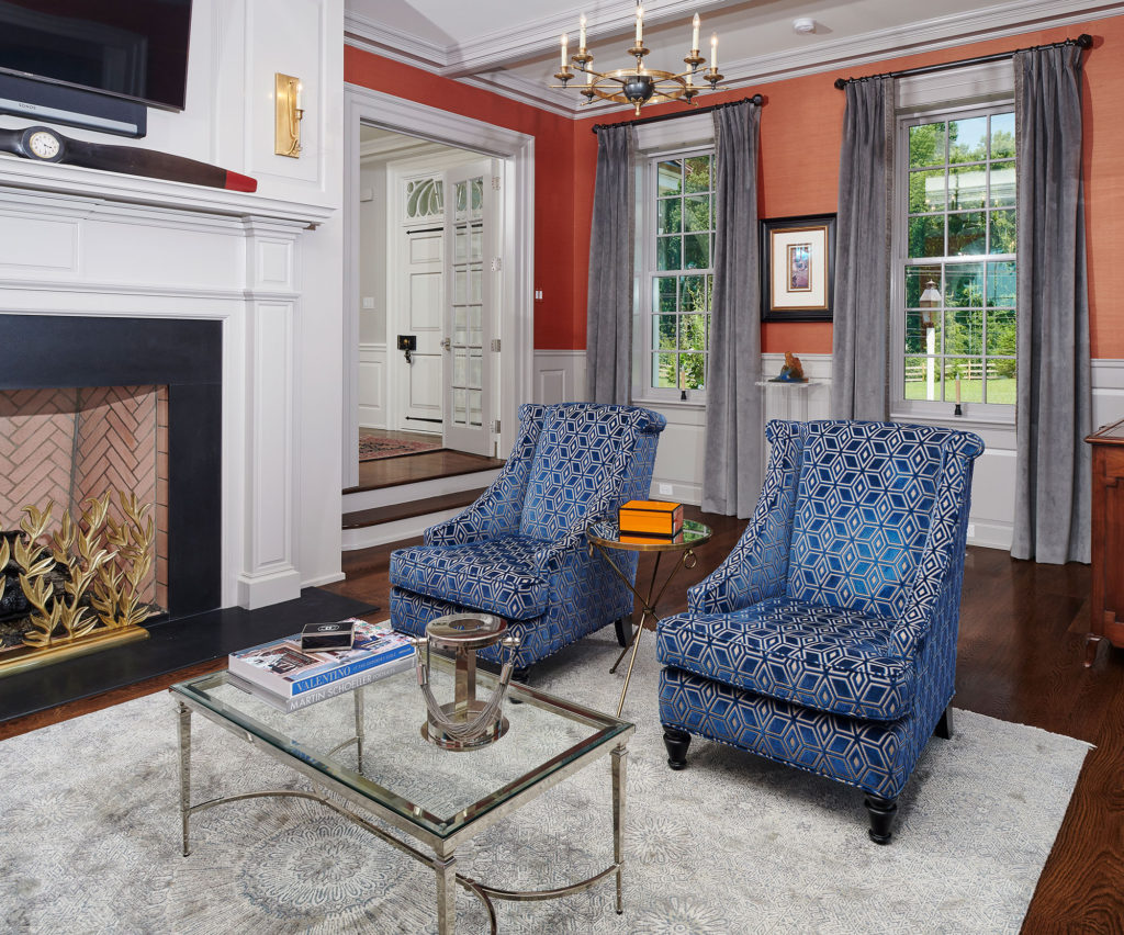
WARM COLORS provide energy; but may over-stimulate. Darker hues can make a cavernous/chilly room seem more intimate. Warm-colored walls advance because of light absorption — making rooms appear smaller. These colors quicken visual movement and are always good for eating areas.
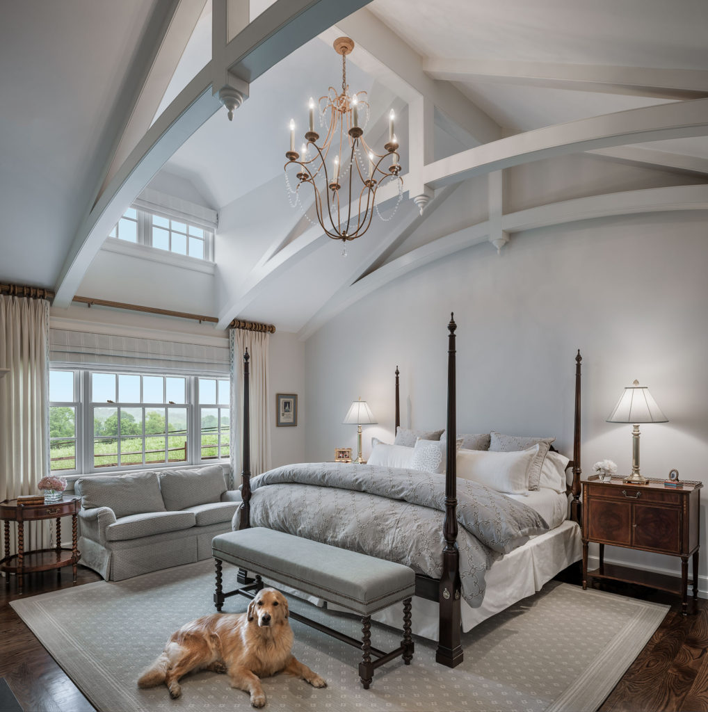
COOL COLORS are generally calming; but used alone may seem cold and impersonal. Cool-colored walls do not absorb as much light, so rooms seem larger. These hues may appear more sluggish than warmer colors; and will not always hold a viewer’s attention. They are a great choice for use in restful areas.
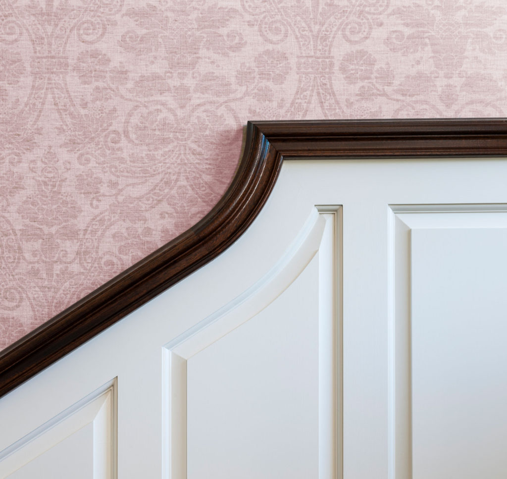
PINK: Healthy, happy, sweet, playful
More widely accepted in all settings, not just feminine. Great as an accent or, in lighter shades, as a base color (think blush). Can uniquely provide warmth and personality.
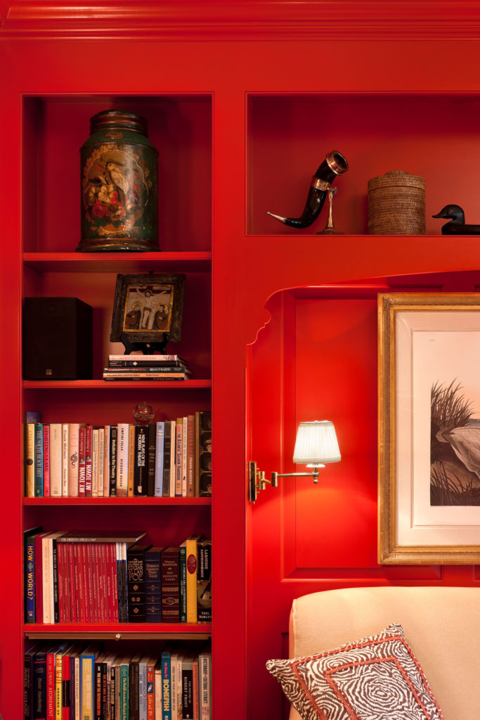
RED: Energetic, passionate, attention-grabbing
This warm hue is shown to increase heart rate. Good for focal points. Not a lot is needed for impact. Can work in many rooms — but use judiciously in a bedroom for optimum sleep.
ORANGE: Lively, vital
Combines the cheer of yellow with the boldness of red. Stimulates appetite. Softer tones like peach can flatter a complexion so are great in salons, at vanities. Bolder tones are good for rec rooms.
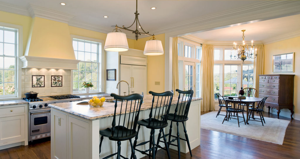
YELLOW: Hopeful, happy, optimistic
The warmth in yellow stimulates creativity and energy; and is motivating. Try in a play space or kitchen. In big doses can overpower, so a lighter shade or a small amount can go a long way.
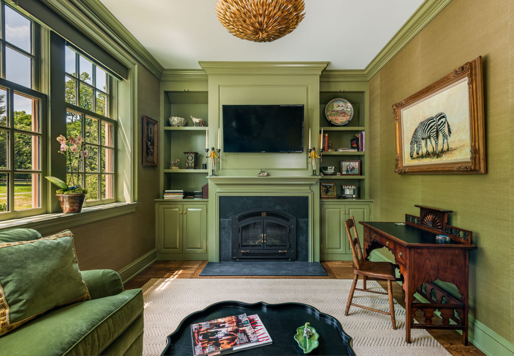
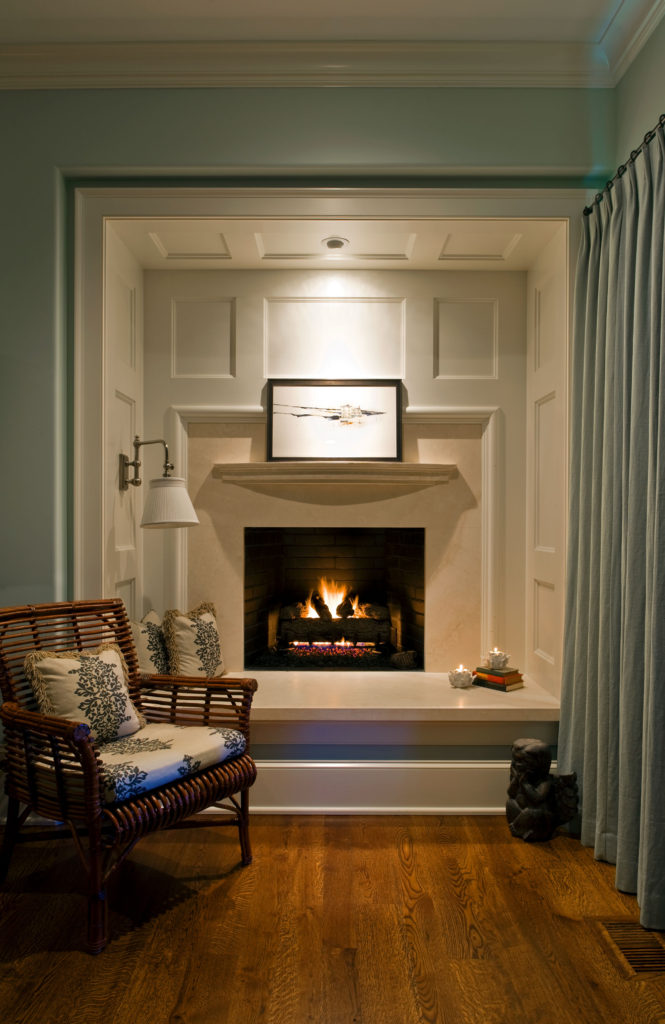
GREEN: Calming, fresh, serene
Symbolizes renewal and awakening. Darker shades imply affluence. Brings the outdoors in. Good in multiple settings like yoga studios, nurseries, libraries. A great marriage of a cool blue and warm yellow.
TURQUOISE: Spiritual, healing, protective, sophisticated
Excellent range from deep to pastel. Interesting alternative to blues and greens.
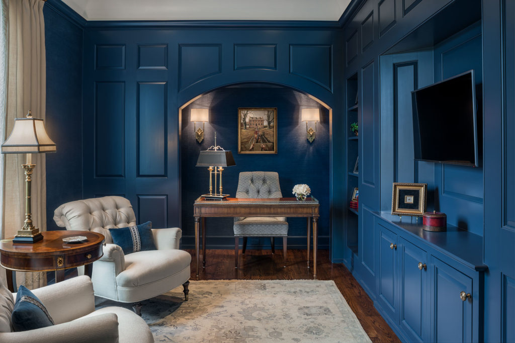
BLUE: Trustworthy, secure, dependable, relaxing
This cool hue puts people at ease and creates a feeling of balance. Good for bedrooms. Known to decrease appetite.
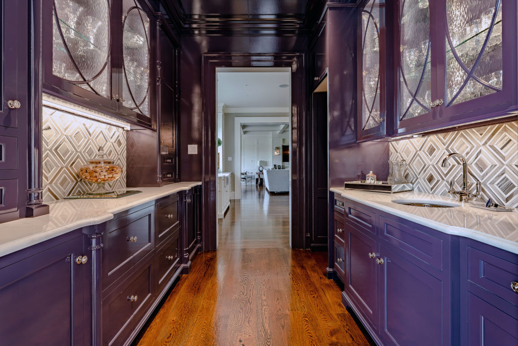
PURPLE: Mysterious, sophisticated, spiritual, royal
Historically, the most expensive pigment, considered exclusive. Today it is readily available and extremely versatile. Exudes the warmth of red and coolness of blue.
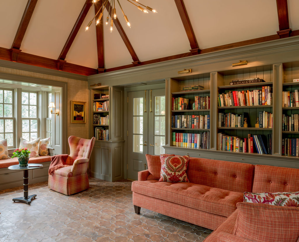
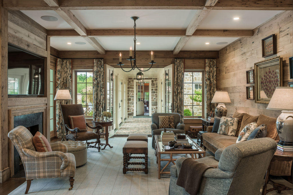
BROWN: Richly earthy, uncomplicated, durable, secure
Can be soft and relaxing or dogmatic and conservative. Popular in dens and living rooms.
TAN/BEIGE: Dependable, flexible, crisp, conservative
Popular neutral. Can range from warm to cool; use to contrast or as a tried-and-true all-over treatment. Some feel it is too safe, but it can go with most anything.
GRAY: Reliable, intelligent, secure
Another popular and versatile neutral, whether warm or cool. Depending on usage, may read gloomy or oppressive. Mixes great with metals, materials, and a wide range of colors.
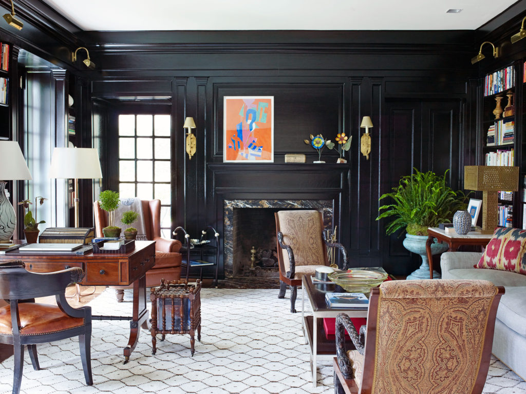
BLACK: Timeless, sophisticated, expensive-looking, chic
Try it as a wall color, not just an accent. And, the finish (flat, eggshell, high gloss, etc.) can significantly change its character.
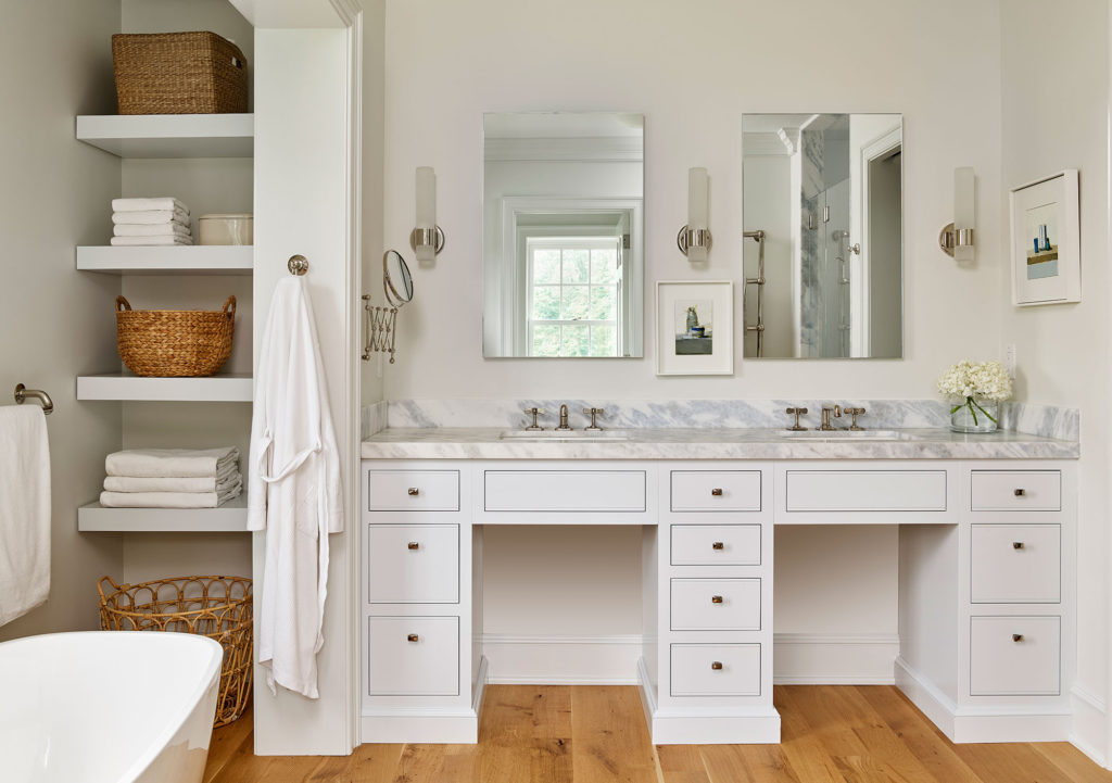
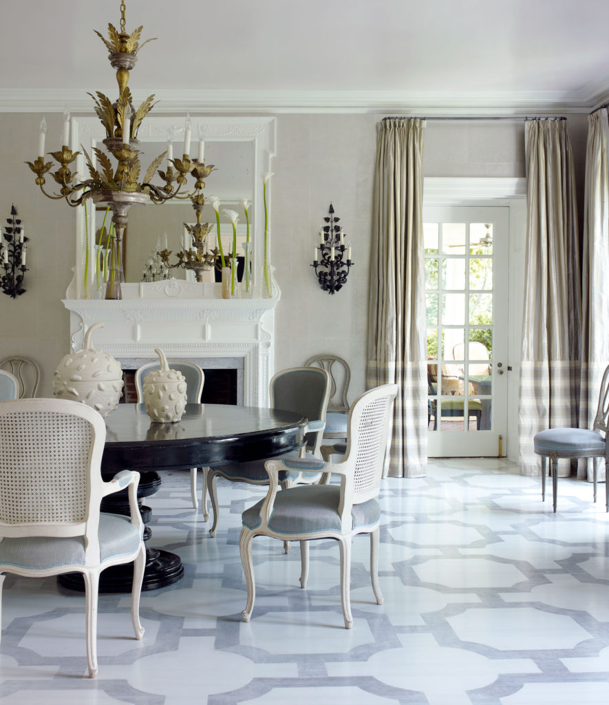
WHITE: Pure, clean, soft, classic
Like black, white provides excellent contrast and can function superbly as a backdrop. Sets a clean, unobtrusive slate for furnishings and art. Layer various tones and textures to avoid a cold and sterile feeling.